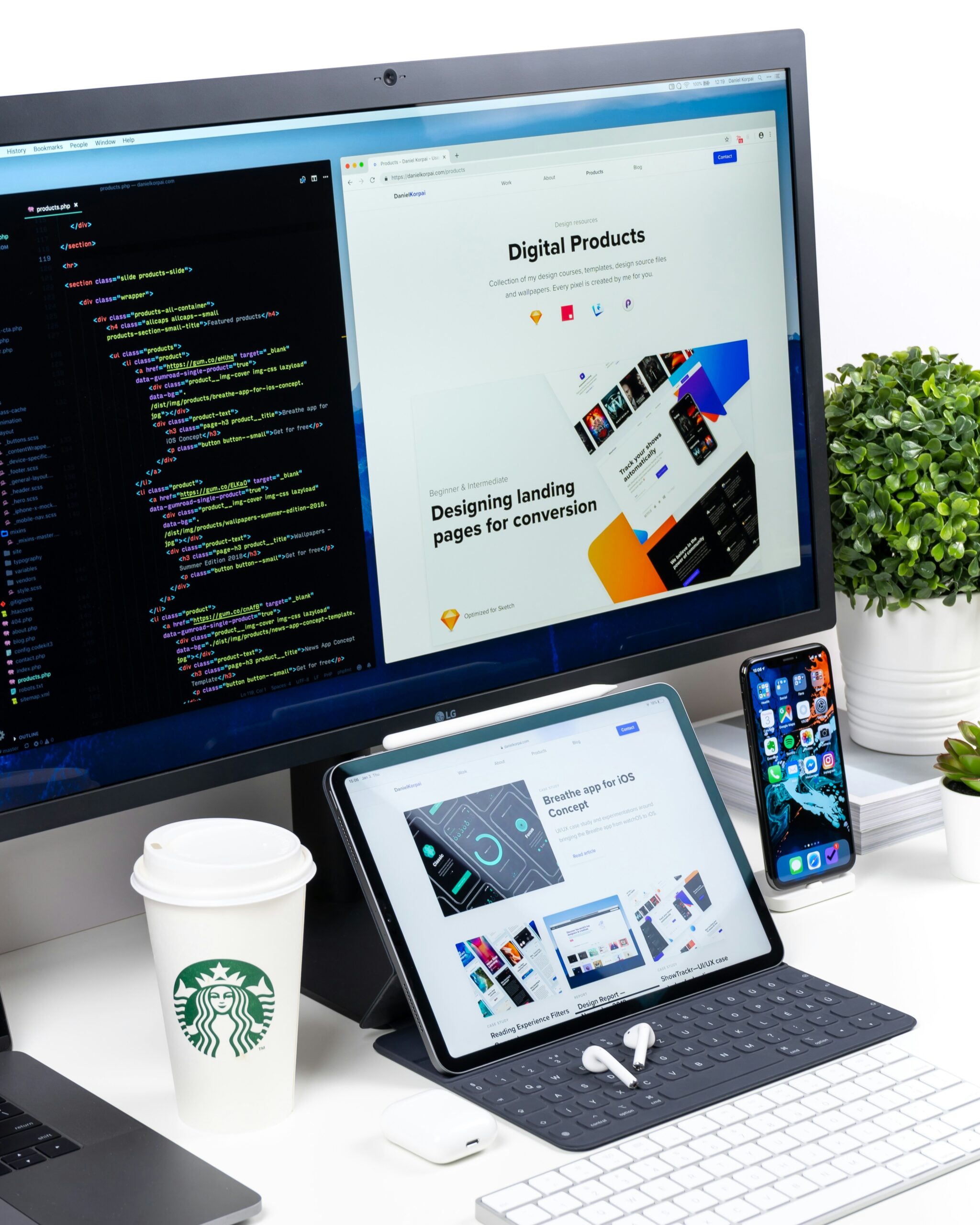
The Blueprint for E-commerce Landing Page Web Development
In the vast digital marketplace, an e-commerce landing page is a unique beast. It is not a full-fledged website with a complex navigation tree; it is a precision tool designed for a singular purpose: conversion.
Whether you are running a paid advertising campaign on Google Ads, driving traffic from a social media influencer, or launching a new product line, the quality of your e-commerce landing page web development will dictate your Return on Ad Spend (ROAS). If you send high-intent traffic to a poorly developed page, you are burning money.
But what separates a landing page that converts at 2% from one that converts at 8%? It isn’t just luck or a pretty picture. It is a meticulous combination of code efficiency, psychological design triggers, and visual branding.
In this comprehensive guide, we will break down the technical architecture, the user experience (UX) principles, and the visual asset requirements needed to develop an e-commerce landing page that actually sells.
The Difference Between a “Web Page” and a “Landing Page”
Before writing a single line of code, developers and business owners must understand the strategic difference between a standard e-commerce page and a dedicated landing page.
- A Standard Web Page (like a homepage or category page) is designed for exploration. It has menus, search bars, and links to social media. It encourages the user to browse.
- A Landing Page is designed for isolation. It removes the navigation bar. It removes the footer links. It removes the social media icons. It presents the user with exactly two options: “Convert” or “Leave.”
In web development terms, this means your landing page should be a standalone HTML file (or a specific, clean template within your CMS) that strips away the bloat of your main site. The goal is to remove friction and reduce cognitive load.
Part 1: The Technical Stack for Performance
In e-commerce landing page web development, speed is not a luxury; it is a ranking factor and a conversion factor. According to Google, if your page load time goes from 1 second to 3 seconds, the probability of a bounce increases by 32%.
1. Core Web Vitals and Server Response
If you are developing a custom page, you must optimize for Google’s Core Web Vitals.
- LCP (Largest Contentful Paint): This is usually your “Hero Image.” It must load in under 2.5 seconds. You achieve this by using modern image formats (WebP or AVIF), compressing the image without killing quality, and preloading the hero image in the HTML header.
- CLS (Cumulative Layout Shift): Have you ever clicked a “Buy” button, only for the page to shift and you click an ad instead? That is CLS. It is the result of poorly coded lazy-loaded images that don’t have fixed dimensions. In e-commerce, CLS is a sales killer. You must hardcode the aspect ratio (width and height attributes) of every image container in your CSS.
2. Choosing the Right Framework
When building e-commerce landing pages, you have two main paths:
A. The “No-Code/Low-Code” Route (Shopify, Webflow, Leadpages)
For most businesses, this is the smart move.
- Pros: Speed of deployment. You can launch a test campaign in an afternoon. No need to hire a back-end developer. These platforms usually handle SSL certificates, CDN distribution, and mobile responsiveness automatically.
- Cons: You are slightly limited in custom functionality. Some templates can be heavy with unused JavaScript, slowing down the page.
B. The “Custom Code” Route (React, Next.js, or Laravel)
For brands with massive traffic or unique interactive needs (like 3D product viewers).
- Pros: Unmatched control over performance. You can create a static site that loads instantly because there is no database query on the initial render.
- Cons: Expensive and time-consuming. You need a professional developer for every minor change (like changing the button color).
The Verdict: For 95% of e-commerce businesses, using a specialized landing page builder or a clean theme on Shopify is superior because it allows the marketing team to iterate quickly without waiting for the IT department.
Part 2: The Anatomy of High-Converting Code
Regardless of the platform you choose, the web development logic must follow a specific structure designed to guide the user down the funnel.
1. Above the Fold: The “Load and Stare” Zone
The top 600 pixels of your page are the most expensive real estate in the digital world.
- The Code: This section should be static. Do not put a heavy video background here unless it is optimized to a very small file size.
- The Assets: This is where your brand clarity matters most. The user must know exactly who is selling to them. This is why a professionally designed logo is non-negotiable. If you are a new brand, using a blurry logo or a default text name here destroys trust instantly.
The V3Design Integration:
When developing a page, the developer needs specific files. You cannot use a JPEG with a white background on a dark hero section; you need an SVG or a transparent PNG. Tools like V3Design are designed to provide production-ready assets. They supply your development team with crisp, scalable vector graphics that fit perfectly into the code, ensuring your brand renders perfectly on a 4K monitor or a budget smartphone.
2. The Product Showcase: Optimizing the “Money Shot”
For e-commerce, the product image is the hero. If you are selling a physical good, your development strategy must support high-resolution zoom functionality.
- Code Implementation: Use a “Zoom on Hover” JavaScript library. However, ensure the high-res image is lazy-loaded. The user only downloads the 5MB image if they actually hover over the product to inspect it.
- The Aesthetic: The background of the product image should match the background of the landing page exactly. If the page is white (#FFFFFF), the product photo background must be white. If the page is off-white (#F9F9F9), the photo must match. This “seamless” integration makes the product look like it is sitting directly on the page.
3. The Trust Badge Strip
This is a simple row of icons: “Free Shipping,” “30-Day Returns,” “Secure Checkout.”
- Development Note: Do not use heavy image files for these. Use vector icons (Font Awesome or inline SVG). They load instantly and look crisp.
4. The “Sticky” Bottom Bar (Mobile)
On mobile, the “Buy” button should not scroll away. The best e-commerce landing page development includes a “sticky” call-to-action bar at the bottom of the screen.
- The UX: It usually shows a thumbnail of the product, the price, and a “Buy Now” button.
- The Code: This is achieved with simple CSS
position: sticky; bottom: 0;.
Part 3: The “Trust Architecture” of E-commerce
A user will not enter their credit card number on a page that feels sketchy. Web development isn’t just about graphics; it’s about building a security envelope.
1. SSL Certificates and HTTPS
This is basic, but you would be surprised how many landing pages miss it. If the browser shows “Not Secure” in the address bar, your conversion rate will tank. Your web development process must include the installation of an SSL certificate to serve the page over HTTPS.
2. Load Time vs. Visual Quality
In the pursuit of a beautiful landing page, developers often overload the page with JavaScript libraries (sliders, parallax effects, complex animations). While these look cool in a demo, they slow the page down.
In e-commerce landing page development, you must be ruthless. Every JavaScript library you add has a “weight.” Ask yourself: “Does this animation increase sales, or does it just increase load time?” If it doesn’t increase sales, delete it.
3. The Checkout Transition
If your landing page is selling directly, the “Add to Cart” button usually routes the user to a checkout system (like Shopify Checkout or Stripe).
- The Development Rule: The transition must be instant. If the user clicks “Buy” and stares at a loading spinner for 4 seconds, anxiety sets in. Use AJAX “Add to Cart” functionality so the page doesn’t refresh. Slide out a mini-cart from the side instead of navigating away. This keeps the user in the flow.
Part 4: A/B Testing: The Developer’s Playground
The beauty of a dedicated landing page is that it is disposable and iterable. Unlike a homepage which serves many masters, a landing page can be duplicated, tweaked, and tested.
When developing your page, structure your code so that it is easy to A/B test. Use a tool like Google Optimize (or VWO) to test:
- The Headline: “Luxury Skincare” vs. “Dermatologist Approved.”
- The Button Color: Green vs. Orange. (Sometimes the “ugly” color wins because it stands out more).
- The Media: A static image vs. a 5-second looping video of the product in use.
The goal of e-commerce landing page web development is not to build one perfect page; it is to build a page architecture that allows you to find the perfect page through data.
Case Study: The Anatomy of a 5% Converting Page
Let’s visualize a successful build. Imagine a landing page for a new line of ergonomic office chairs.
- Header: (No navigation menu). Just a clean, precise logo on the left (built using V3Design to ensure it looks like a Fortune 500 company, not a startup). On the right, a phone number for “Sales Support.” The presence of a phone number increases trust for high-ticket items.
- Hero Section: A high-res image of a person sitting in the chair with perfect posture. The headline reads: “Your Back Will Thank You.” The sub-headline: “Ergonomic support. Premium leather. Free 2-day shipping.” The “Buy Now” button is in a contrasting orange.
- Social Proof Bar: “As seen in Forbes, Wired, and TechCrunch” (using greyed-out logos of those publications).
- Feature Grid: Three columns. “Lumbar Support,” “Breathable Mesh,” “10-Year Warranty.” Each has a crisp vector icon.
- The “Exploded” Product View: A high-quality image showing the chair deconstructed, highlighting the quality of the internal mechanics. This justifies the $500 price tag.
- Testimonials: Three quotes with 5 stars and headshots of real-looking people.
- Risk Reversal: “Try it for 30 days. If you hate it, we’ll pick it up and refund you in full. No questions asked.”
- Final CTA: “Ready to upgrade your office?” [Buy Now Button].
This page is light, fast, trustworthy, and focused. It converts.
Conclusion: Development is the Vehicle, Design is the Engine
You can have the fastest car in the world, but if it has no engine, it won’t go anywhere. The same is true for e-commerce landing pages.
The code (HTML, CSS, JavaScript) provides the vehicle—the speed, the reliability, the responsiveness. The design (the logo, the colors, the imagery) provides the engine—the emotional pull that makes the user want to buy.
When approaching your next e-commerce landing page web development project, you must balance both. Invest in clean code that loads fast and works flawlessly on mobile. Invest in professional brand assets that make your company look established and trustworthy.
By leveraging advanced branding tools like V3Design to handle the visual identity, your development team can focus on what they do best: writing clean code that converts.
Stop sending traffic to a dead end. Build a landing page that turns clicks into customers.